Vonrd
-
Posts
5,776 -
Joined
-
Last visited
-
Days Won
495
Everything posted by Vonrd
-
BOx update today. This was interesting: The tank turret stays in place when the player switches from the gunsight view to another station and there are no visible enemy targets for AI gunner to engage;
-
Do you have these? Panel Finder.bmp
-
Gahhhhhhh....
-
Went down the Google Rabbit hole and stumbled across this: http://www.fokkerdr1.com/Mainpage.htm I was particularly interested in the factory construction photos of V4 (prototype).
-
Yes, I have tried these and they're interesting and may allow a bit of filtration in order to identify details. However, regarding color interpretation, without some verbal or text regarding the colors it's nearly impossible to decipher individual colors from Orthochromatic film images (common in use in WWI. By WWII some Panchromatic film was in use) but what really shakes the dice is that we have no idea whether filters were being used and, if so, which ones they might be. This from a modelers site: US made b&w film was made to be less sensitive to blue light. US photogs tended to use orange filters more. German film was made to be more sensitive to reds. Use of light [very pale] yellow filters more common. French made film was more sensitive to greens. Use of mid-yellow filters more common. British films were more sensitive to reds/greens. Use of light to mid yellow filters more common. Russian films tended towards an ortho film. No use of filters common. All western films changed about 1958, to a more common pan film and sensitivity ratings - ASAWarPac films changed between 1968-72, to about three types of pan film, ranging from near ortho to true pan and two sensitivity ratings - GOST and DIN and this: Ordinary or common film ( color-blind ) was sensitive to light in the blue spectrum, violet and ultraviolet, and besides being cheaper, it only required yellow -green or red light in the darkroom. Using this film the red and yellow tones in the final print looked very dark and the clouds of a blue sky tended to become invisible, blending into the background unless a filter was used. - Orthochromatic films themselves, sensitive to the spectra blue, violet, ultraviolet, but also green and yellow in varying degrees depending on the quality and type. These films require dark red light in the development phase and while the yellow tones can be lighter in print than using colour-blind film, their hue varies depending on the quality of the emulsion and the processing, while red tones still appear dark, seen that the film is not sensitive to red light. They were often the preferred choice for portraits because of the good rendering of contrast. - Panchromatic film, sensitive to blue, violet, ultraviolet, green, yellow and red, while translating the colors into shades of gray closer to the experience of the human eye, remained also variable in the results because of its quality, conservation status and the skill of those who developed it, and it required total darkness in the darkroom. This films, however, offered a reduced contrast compared to common and orthochromatic . With all of these kinds of film the use of filters was very common: yellow and amber, in particular, often intended to diminish - with variable results - the effect of ultraviolet light, invisible to the eye but very visible on film, or to correct contrast and brightness of the final result . At the time the use of these filters was an integral part of the art of the photographer, and they were used very often. The above is an extreme simplification of the technology available at the time, and there were in fact emulsions which came "halfway" between the types described, despite being advertised and sold as orthochromatic or panchromatic. The subject would deserve much more research and I am sure I have just scratched the surface of what we could find. I hope that this may help a better understanding of how difficult – and indeed treacherous – the interpretation of colours from B/W prints can be. Peter Jackson's "They Shall Not Grow Old"'s impact, for me was due more to the fining of the grainy detail, slowing the framerates and adding overdubbed sound. The colors are believable. Whether or not they are correct is immaterial. The above wave of discourse is just a (probably too) verbose way of saying that we can never be certain of true colors (even existing swatches / examples are subject to fading / changing). My feeling is to make things believable. And Klai, yes I understand your point of using it as a tool to find hidden details and not to find actual colors. I did minor in photography in grad school and focused almost entirely on B&W view camera. Interesting comparison of two film types:

-
Yeah, color rendering has been another PITA. This is what Heinrich, Klai and I have come up with so far. I'm generally using cda40a for yellow on the WW2 birds and bf9c00 for WW1. Red is also problematic. I use 941f17 for WW2 and 830002 for WW1. All are below the shadows, weathering, etc. layers. Colors seem to vary from template to template and even within various areas of the model. What is the number or RGB numbers for your orange / yellow?

-
Yup... that's what I use. Yeah, all of the editing of n-maps is a PITA if there are differences from one skin to the next. Even if you did seperate ones for each skin (oh my head hurts!) good luck getting everyone to download and install them. Too bad they're not attached to the dds file like the alpha maps are.
-
Genius??!!... nah, just your run of the mill sub-genious That looks great! I think the "sheen" is much more appropiate now. What did you do? Did you tone down the weave? I hope to see your normal map once you get it finalized. How are you manipulating the normal maps? Are you using the Nvidia normal map plug in in for photoshop or something else? I had another thought that you could incorporate the brushstrokes from your insignia into the normal map to give the strokes a subtle 3D affect.
-
Chag sameach Klai!
-
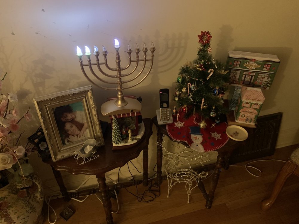
Happy Hanukkah, Kwanzaa and Merry Christmas! (The photo is my sister in law and her adopted Black daughter - who is now in college and over 6 ft tall ) Baruch Atah Adonai Eloheinu Melech Ha'olam, asher kidshanu b'mitzvotav v'tzivanu l'hadlik ner shel Hanukkah (blessing said as each candle is lit..."Blessed are You, Adonai our God, Sovereign of all, who has kept us alive, sustained us, and brought us to this season"). And BTW... I'm a Buddhist, so Happy Bodhi Day!
-
Does anyone have actual photos of Focke Wulf Fw 190 A-4 Flown by Oberleutnant Wolfgang Leonhardt, 6./JG 1, Woenstrecht/Holland, October 31 1942? While doing the new Fw190A-3 skins I became intrigued by this camo scheme and decided to do a historical skin. All that I can find so far is artwork and scale models. I'd like to have some photographic verification though. The stripes vary from crisp (unlikely) to airbrush (more likely) and differ in how they terminate at the nose. Would anyone want this scheme for their personal skin?

-
Is this the correct TS? wingwalkers.teamspeak3.com Edited for privacy.
-
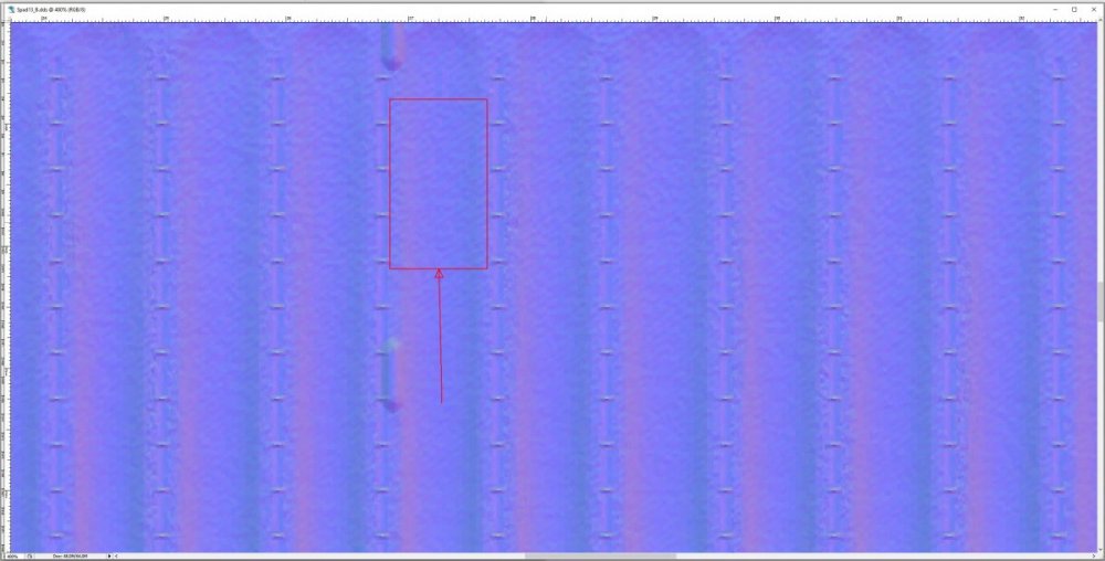
I haven't either except for a couple of ventures into trying to make mud spatters look more 3D... still in process. I was thinking that maybe manipulating the "texture" (see the square between the rib bays, this is the normal map from the SPAD) might allow the illusion of the proper dope "sheen". Not sure if it needs to be more or less. I know that you love a challenge I'd love to hear your findings if you do give it a shot. I'll do the same but I'm deep into revising our skins and don't have much spare time.
-
This is the link to Wing Walkers skins that they will be using for the memorial. Please download and install. https://www.wingwalkers.org/topic/7983-memorial-flight-honoring-tim-owens-wwicy/
-
I have posted my condolences on the WW site and to Geezer regarding the extremely sad and untimely passing of ICY so I won't repeat here. I plan on attending for sure. I did post a link to our new Bf 109 skins per Geezer's request. I added a 109G2 skin for Butzzell so that he has something to wear. Hotlead and any other WW1 types that don't have WW2 skins, let me know and I can make a uniform for you if you want to attend. All who plan on attending please be sure to download and install the new Bf 109 skins here so that we can be properly dressed: https://www.dropbox.com/s/tttoj4d2yj2emso/PPR Great Battles Bf109 Final 11-20-20.zip?dl=0 (Butzzell's is in there now but for those who have already installed them Butzz's skin is attached here.) I believe that Oesau regular Tues night practice will be cancelled. And, I have the password for the memorial so either PM me or see me on TS. This is their TS: wingwalkers.teamspeak3.com. Edited for privacy. v_!_JG1_Bf109G2_Butzzell.dds
-

Flanders in Flames Fall campaign 2020 update
Vonrd replied to Butzzell's topic in FIF General Discussion
Understood but there is only one server isn't there? -
Flanders in Flames Fall campaign 2020 update
Vonrd replied to Butzzell's topic in FIF General Discussion
Kliegmann has scheduled a EIF test on the 19th: -
Flanders in Flames Fall campaign 2020 update
Vonrd replied to Butzzell's topic in FIF General Discussion
We'll have to wait and see what develops but if they do come out with FC2 before FIF spring I would think that it should be changed to FC (again, depending on what develops). Of course, it would ultimately be up to Butzz. -
Flanders in Flames Fall campaign 2020 update
Vonrd replied to Butzzell's topic in FIF General Discussion
Well, if FC2 comes out... -
It's done and download link at the 1C forum: https://forum.il2sturmovik.com/topic/67402-fw-190-a3-sharkmouth/
-
Posted on the 1c forum: https://forum.il2sturmovik.com/topic/67402-fw-190-a3-sharkmouth/
-
One way to emulate the woven fabric might be to work with the normalmaps. However, as one who has done many real life dope and fabric jobs on full size aircraft, the weave usually isn't visible. That may have been different in early WW1 jobs with just minimum coats of clear nitrate dope but once you start using aluminum dope the weave gets filled. EDIT: (I should have read your post more closely... you are not talking about the fabric weave... still, I wonder if playing with the textures of the normalmap might have an additional illusion in regards to reflectivity and gloss.) As you have no doubt found (as I see from your graph), the difference in the gray percentage for slight gloss, high gloss and matt is very tricky and seems to vary throughout the surfaces of the planes. Have you tried grays (flat throughout) with no textures / shadows in the alpha? Interested to hear of your findings.
-
Another one from the site https://www.youtube.com/user/PlayingForChange. Lots of great songs with musicians from around the world collaborating remotely.
-
What a wonderful world...
-
One of the best bass bridges ever...